
Interior Painting Options for a Fresh Home Refresh
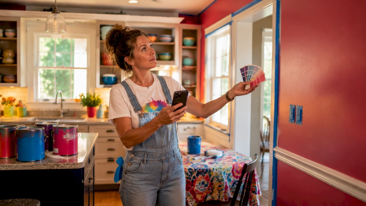
Interior painting options for home refresh projects cover far more than picking a color off a chip card. The right combination of color, finish, and technique transforms how a room feels, functions, and holds its value over time. Brands like Benjamin Moore and Sherwin-Williams have shaped 2026 color trends toward warm neutrals and muted greens, moving away from the cold grays that dominated the last decade. This guide breaks down every practical option, from paint selection to creative techniques, so you can make confident choices that fit your budget and your home.
1. How to choose paint colors that actually work
Color selection is the single decision that affects every other choice in a room. Get it wrong and even a perfect finish looks off. Get it right and the whole space clicks.
The biggest mistake homeowners make is choosing a color from a small chip under store lighting. Lighting dramatically changes paint undertones. A north-facing room pulls cool light all day, which makes gray-blue tones look dingy and cold. Warm whites and soft taupes correct that imbalance without making the room feel heavy.
For most homes, three colors consistently perform well across different lighting and room styles: Benjamin Moore White Dove, Sherwin-Williams Agreeable Gray, and Benjamin Moore Pale Oak. These neutrals work because they carry warm undertones that read as clean without going stark white.
Warm neutrals work in living rooms, hallways, and bedrooms
Muted greens (sage, olive, moss) suit kitchens and dining rooms in 2026 trends
Deep, saturated tones work best as single-room statements, not whole-home colors
Cold grays should be avoided in north-facing rooms where they amplify blue light
Pro Tip: Test a 12x12-inch painted sample directly on your wall and live with it for 48 hours, checking it in morning light, afternoon sun, and evening lamp light before committing.
When you have an open floor plan, coordinate colors across connected rooms so the transition feels intentional. A warm white in the living room flowing into a soft greige in the kitchen reads as a design choice, not an accident. You can read more about how paint affects room mood before locking in your palette.
2. Which paint finish is right for each room?
Paint sheen is as critical as color. The wrong finish in the wrong room wears out fast, looks cheap, or makes every wall flaw visible.
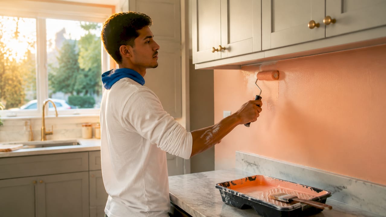
Sheen selection influences both how a surface looks and how long it holds up under cleaning and moisture. Flat and matte finishes absorb light, which hides surface imperfections well. They work in low-traffic areas like adult bedrooms and formal dining rooms. Eggshell adds a slight sheen and handles light cleaning, making it the go-to for most living rooms.
Finish | Best rooms | Durability | Cleaning ease |
Flat/Matte | Bedrooms, ceilings | Low | Difficult |
Eggshell | Living rooms, hallways | Moderate | Easy |
Satin | Kitchens, bathrooms | High | Very easy |
Semi-gloss | Trim, doors, cabinets | Very high | Excellent |
Satin finishes are washable and moisture-resistant, which makes them the right call for kitchens and bathrooms. Semi-gloss belongs on trim, doors, and cabinets because it reflects light cleanly and wipes down without damage.
Pro Tip: Always finish trim and doors in semi-gloss even when the walls are flat or eggshell. The contrast in sheen reads as intentional craftsmanship and makes the room look more polished.
3. Creative painting techniques that go beyond basic walls
A fresh coat of the same color on the same walls is the least interesting thing you can do with a can of paint. These techniques cost roughly the same but deliver dramatically more visual impact.
Color drenching is the biggest shift in interior design right now. Color drenching means painting walls, trim, and ceiling the same color to create a cocoon-like, immersive room. It replaces the single accent wall, which now reads as dated. A deep forest green or warm terracotta applied to every surface in a room feels intentional and current.
Two-tone walls split the wall horizontally, typically at chair rail height or two-thirds up. The lower section uses a darker shade and the upper section uses a lighter one. This technique adds architectural interest to rooms that have no molding or built-ins.
The ceiling as the fifth wall is an underused move. Painting the ceiling a soft color, even just one shade darker than the walls, draws the eye up and makes the room feel finished. A pale blue ceiling in a white room reads as sky. A warm blush ceiling in a neutral bedroom adds warmth without changing the walls at all.
Textured finishes like limewash and plaster paint add depth and hide imperfections better than flat paint. Limewash creates a soft, chalky, aged look that works especially well in older homes where walls are not perfectly smooth. Plaster finishes add a tactile quality that photographs well and holds up over time.
Cabinet and trim painting is the most cost-effective refresh in any home. Painting dated oak cabinets in a deep navy or warm white costs a fraction of replacement and delivers a near-total visual transformation.
4. Steps to prep and execute an affordable painting project
Preparation determines the final result more than any other factor. Skipping it is the most common reason a paint job looks amateur six months later.
Clean all surfaces. Grease, dust, and grime prevent paint from bonding. Wipe walls with a degreaser before any other step.
Patch and sand. Fill holes and cracks with Spackle or joint compound. Sand smooth once dry. Professional painters devote about 40% of job time to surface preparation. That ratio reflects how much prep matters.
Prime where needed. New drywall, dark colors, and stain-prone surfaces all need primer. Skipping primer on a dark-to-light color change means three or four coats instead of two.
Apply two full coats. Two coats are the industry standard for any color change or high-traffic surface. One coat produces streaks and uneven sheen.
Get a written estimate before hiring. Professional painting estimates involve a thorough on-site assessment and a transparent written breakdown. Reputable contractors deliver an estimate within 24 hours of the walkthrough.
Affordable interior painting costs range from $1,200 for a single room to $6,000 or more for a full home repaint including ceilings and trim. That range depends on room size, surface condition, and the number of coats required. Knowing that range before you call a contractor puts you in a stronger position to evaluate quotes. You can also review what the renovation process involves to set realistic expectations before work begins.
5. Comparing popular interior painting options by scenario
Not every technique or color suits every situation. This comparison matches the most common home refresh scenarios to the right painting approach.
Neutral color comparison
Color | Undertone | Best rooms | Avoid in |
Benjamin Moore White Dove | Warm cream | Any room, any light | N/A |
Sherwin-Williams Agreeable Gray | Warm greige | Living rooms, bedrooms | Rooms with yellow lighting |
Benjamin Moore Pale Oak | Soft beige | Kitchens, hallways | Very dark rooms |
Creative technique comparison
Technique | Cost level | Complexity | Visual impact |
Color drenching | Low | Low | Very high |
Two-tone walls | Low | Moderate | High |
Limewash finish | Moderate | Moderate | Very high |
Ceiling color | Very low | Low | High |
Cabinet painting | Moderate | High | Very high |
Situational recommendations:
Small budget, big impact: Paint ceilings and trim in a contrasting sheen. Cost is minimal and the visual lift is immediate.
Older home with flawed walls: Use limewash or plaster finish. Texture hides imperfections that flat paint exposes.
Open floor plan: Stick to one warm neutral family across connected spaces. Vary depth, not the base color.
Kitchen or bathroom refresh: Satin finish on walls, semi-gloss on cabinets and trim. Both surfaces clean easily and hold up to moisture.
Painting projects that add measurable home value tend to combine neutral color choices with high-quality finishes in high-traffic areas. That combination appeals to the widest range of buyers and daily users.
Key takeaways
The most effective interior painting refresh combines the right color undertone, a finish matched to room function, and at least one creative technique that goes beyond flat walls.
Point | Details |
Test colors before committing | Apply 12x12-inch samples and observe them for 48 hours in all lighting conditions. |
Match finish to room function | Use satin in kitchens and bathrooms, eggshell in living rooms, semi-gloss on all trim. |
Prep is 40% of the job | Cleaning, patching, and sanding surfaces determines whether paint lasts or peels. |
Two coats are non-negotiable | One coat produces streaks and uneven coverage on any color change or high-traffic wall. |
Creative techniques multiply impact | Color drenching, limewash, and ceiling color deliver high visual impact at low added cost. |
What I’ve learned from years of painting Milwaukee homes
Most homeowners spend too much time choosing a color and not enough time choosing a finish. I have walked into rooms where the color was beautiful and the finish was completely wrong for the space. A flat paint in a kitchen with kids looks worn out within a year. A semi-gloss on bedroom walls makes every bump and roller mark visible from across the room. Getting both decisions right at the same time is what separates a paint job that holds up from one that needs redoing in two years.
The other thing I see constantly is homeowners skipping the sample step. They pick a color they love on their phone screen, buy a gallon, and paint the whole room. Then they call us because it looks nothing like what they expected. Forty-eight hours with a large sample on the wall costs almost nothing and prevents that situation entirely.
My favorite affordable technique right now is color drenching in a warm muted green. Paint the walls, ceiling, and trim the same sage or olive tone and the room feels completely transformed. It reads as a design decision, not a budget move. Pair it with white linen and natural wood and you have a space that looks current without chasing trends that will date in three years.
The timeless rule is this: choose colors that work with your fixed elements, floors, countertops, and cabinetry, not against them. A color that fights your floors will always look wrong, no matter how much you love it on the chip.
— Ricco
Ready to refresh your home with Manycolorswi?
Manycolorswi brings professional interior painting services to Milwaukee homeowners who want real results without surprise costs. Every project starts with an on-site consultation and a transparent written estimate so you know exactly what you are getting before work begins.

The Manycolorswi team handles surface preparation, color consultation, and full application from first coat to final trim. Every crew member is trained, motivated, and invested in the outcome. If you are ready to move from planning to painting, explore our home improvement services and get your project started today.
FAQ
What are the best paint colors for a home refresh in 2026?
Benjamin Moore White Dove, Sherwin-Williams Agreeable Gray, and Benjamin Moore Pale Oak are the top-recommended neutrals for 2026. They carry warm undertones that work across different lighting conditions and room styles.
How much does affordable interior painting cost?
Affordable interior painting ranges from $1,200 for a single room to $6,000 or more for a full home repaint including ceilings and trim. Final cost depends on room size, surface condition, and number of coats required.
What paint finish should I use in a kitchen or bathroom?
Satin finish is the right choice for kitchen and bathroom walls because it resists moisture and wipes clean easily. Use semi-gloss on cabinets and trim for maximum durability.
How do I avoid picking the wrong paint color?
Apply a 12x12-inch sample directly on your wall and observe it for 48 hours in morning, afternoon, and evening light. Color undertones shift significantly depending on the time of day and the type of light in the room.
What is color drenching and is it worth trying?
Color drenching means painting walls, trim, and ceiling the same color to create an immersive, cohesive room. It is a leading 2026 design trend that delivers high visual impact at no extra material cost compared to a standard paint job.
Recommended
Comments